
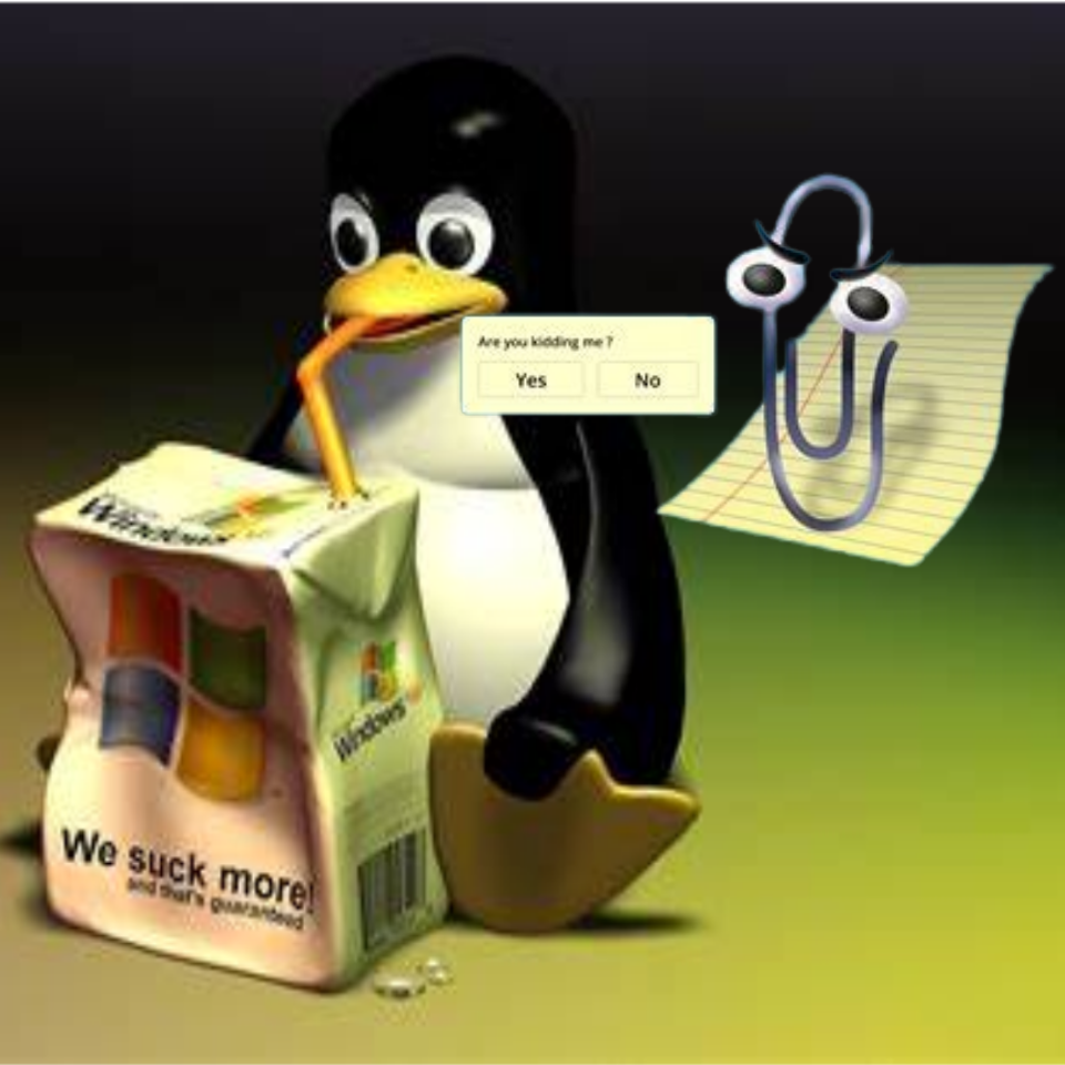
Why having an overcomplicated system like this instead of some printed gels for the brands that cost $1 and can be swapped out easily is beyond me.
Spoken like someone that is not a Dev Operative 🤓. Does your gel idea compensate for humidity 🤓? Or optimize for profit🤓? How then I ask, can it be called a sugary drink dispenser? … 🤓
Oh my god thank you. I saw this exact image on another site, except the text said “I found the BIOS flavor.” I was like “wtf this person has no idea what BIOS is” and proceeded to explain what it really was.
Penguin flavored. Sudo Refreshing
Linux has jumped the shark, it’s an Icee flavor.
The penguins yearn for the ice.
This seems fake, why would they use a separate computer for each drink type? Shouldn’t they all be dead?
Nope, it’s totally real.
Oddly, the one on the right at my 7-Eleven dies as well.
The current state of things, you can get four single board computers cheaper than one single board with four display drivers. They might even be individual touch screens.
Single board computers that can handle one screen are pretty cheap these days. Ones that can handle multiple screens would be more custom, thus expensive.
I prefer upstart myself
Everything’s better than Systemd.
Why ? I keet hearing “systemd bad” for years now. But I never saw any convincing arguments. Not saying that rejecting systemd is wrong but why would I ? I have been using Linux since 2004 to give you an idea of where am coming from.
systemDeez nuts
At least it’s not blue screen of death.
Tastes like Mint
“it tastes like pennies and batteries!”
./thatsThatGoodGood.shI’m afraid my brain would segfault. So I’ll stick to safer flavours.
Looks shopped, right?
I think it’s AI-mangled. I found this older version over on Reddit, posted there on August 2nd.

Notice that that version looks less shopped around the systemd output, has more detail in the metal pieces and in the shadows around the cardboard, and still has an electrical outlet in the back.
Wow yeah, the bolts are also round rather than hexagonal. And it has that weird AI contrast all over it.
also the mtn dew sign looks so uncanny and shiny
AI mangled or just compressed multiple times as its been shared around? Probably a download of a compressed version a few times before ending up with this text? It looks lower resolution and cropped rather than substantially changed to me.
I don’t think it’s just normal edit-compress-cycles.
- The cropping theory doesn’t align with the cardboard piece
- The second flavour from the right has lost the term “Freeze” from its name somehow
- The way the metal ring on the refill plug has merged with the vertical metal piece on the outlet just screams of a typical AI-not-understanding-functional-parts error to me.
Maybe an AI-upscaled version of a reposted low-res (and on the way to being deep-fried) jpeg?
The lines of the wall behind also look different, and there’s some edges around part of the screen in the post that aren’t there in the original.
Also, the carton behind looks to be in a slightly different place.
Also, the 7-eleven logo on the working display has disappeared.
Not just the logo, look again, I missed it too at first, an entire word is gone from the name :D
On top of that the whole dispenser part is just entirely different except shape and colour.
I’m so bewildered by this. It’s like a photographic Mandela effect.
@memesmadetorunonlinux@techhub.social where did you find this version?
Doubtful, someone definitely Gimped it though
😄 Sure, I meant shopped as in a verb meaning digitally altered.
;)
I was wondering… Each „screen“ a system?
That’s what I thought at first, then, that one is probably accidentally mapped to console rather than the flavour display.
Grub flavor. Always hits the spot.
Linux Juice.
initcpio juice.
tastes like zstd compressed .img


